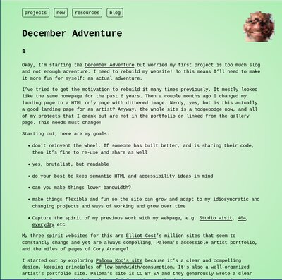
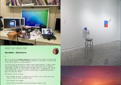
Okay, I’m starting the December Adventure but worried my first project is too much slog and not enough adventure. I need to rebuild my website! So this means I’ll need to make it more fun for myself: an actual adventure.
I’ve tried to get the motivation to rebuild it many times previously. It mostly looked like the same homepage for the past 6 years. Then a couple months ago I changed my landing page to a HTML only page with dithered image. Nerdy, yes, but is this actually a good landing page for an artist? Anyway, the whole site is a hodgepodge now, and all of my projects that I crank out are not in the portfolio or linked from the gallery page. This needs must change!
Starting out, here are my goals:
My three spirit websites for this are Elliot Cost’s million sites that seem to constantly change and yet are always compelling, Paloma’s accessible artist portfolio, and the miles of pages of Cory Arcangel.
I started out by exploring Paloma Kop’s site because it’s a clear and compelling design, keeping principles of low-bandwidth/consumption. It’s also a well-organized artist’s portfolio site. Paloma’s site is CC BY SA and they generously wrote a clear website info page which has lots of information on the design, going into things like lazy-loading images, minimizing js, using system fonts. Seems like a great way to get started. In fact, it’s how I’m getting this site started!
One problem I have is that I crank out a ton of projects. I have hundreds. You wouldn’t know that from the current website portfolio page, and some are tiny projects and others are big. So I’ve also studied Cory Arcangel’s site, who is the Merzbow of joke gallery objects. His site is designed to just list all of his art things, from websites to bots to saleable objects to each individual slightly different color shade sculpture. Certainly it’s a minimal site design in some ways, but he uses Jekyll, which I have many years of experience working with now, and I’m not keen to build my own portfolio with it. To be honest, this is Cory’s worst incarnation of his website. It’s no longer fun to browse and his art has grown less interesting for me lately, but I’ll just keep that to myself.
I also looked at Increpare’s site since he cranks out dozens or hundreds of games too, to glean how that could look. The design is not fancy but it’s fast and quickly shows what each game looks like and their info pages are straightforward, though maybe under-informing.
I also looked at some friends’ sites too that use long lists of projects that link to individual project pages. Not the right approach for me. I determined that it is important to me to have at least one image for each project that links to the project page. In contrast, there are some websites that are text only lists that link to project pages, but that’s not a fun way (for me) to browse when designing work meant to be seen.
I spent time perusing cargo.site since they have nice brutalist templates, but when I actually try those sitesI find many harder to navigate through or not nearly as expansive as my site needs to be to capture all my work.
Okay, so I’ve tried some things, looked at code, ran some code. I am not linking it here but I pretty quickly 1-for-1 re-built my a clone of Arcangel’s site in about 20 minutes. This is only because I’ve a lot of experience with Jekyll and his CSS is dead simple.
So if I’m not a fan of the Jekyll static site generator but also find HTML tedious when I have hundreds of pages then one other aspect of this is to build my own static site generator. I generally prefer using pandoc for converting between formats, so I’ll create a wrapper around that.
And that’s what I’ve done here: I built this very December Adventure page tonight starting with HTML and CSS from Paloma (thanks!) and then modifying, and using pandoc with a structured system.
Here’s the foundation of the static site builder, which runs after save:
#build.sh
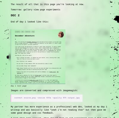
pandoc -s index.md -o index.html -H assets/includes/header.html -c assets/css/main.css --metadata title="December Adventure"The result of all that is this page you’re looking at now.
Tomorrow: gallery view page experiments
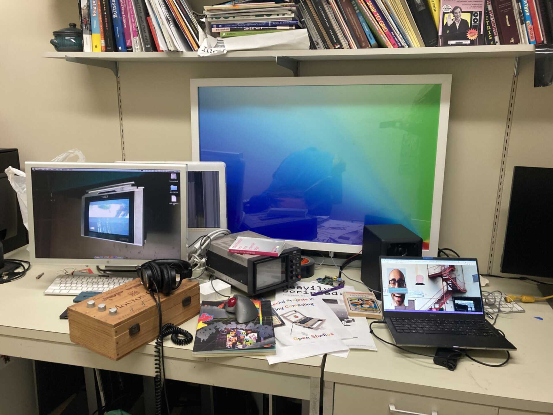
End of day 1 looked like this:
Images are converted and compressed with imagemagick:
convert source.png -resize 400x -quality 85% output.jpgMy partner has more experience as a professional web dev, looked at my day 1 writeup and was basically like “yeah i’m not reading that” but then gave me some good design and css feedback.
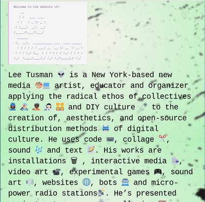
I took that into account, then showed them an old experiment page I did with an overlay. She suggested I try it using css background with a container. Because I’m trying to use out of the box semantic web classless CSS I got into a roadblock where I wanted the speckled digital dirt as an overlay for the whole page whilst also having the gradient background. At first this appeared impossible, with whichever is latter replacing the earlier one (due to ‘cascading’) but after some searching I came across a solution to place them in the same css line and it worked. Then I added some background blur to the body to try to make the text more readable, and played around a bit to balance trying to soften the hard edge of the bounding body box versus readability. I’ll try to get some feedback later on whether this is as compelling design, and to test the readability/accessibility.
Here’s the current page design:
Beginning of day 3, here is the site currently. I didn’t quite get to the gallery pages yet, but will try today.
I tracked down some tricky bugs today and no one but me will know but I’m writing it out anyway: basically, although my body background image speckles were blurred below the centered body section with text on desktop cross-browser, I found that the background wasn’t blurred on iOS Firefox or Safari browsers that I tested. I couldn’t quite find the answer online, but I noticed that the backdrop-filter css selector was relatively new and re-read the caniuse.com page for it several times. There’s no firefox iOS column there and I remembered that firefox on iOS is actually webkit. iOS Safari requires a trick to figure out its version - it’s based on what iOS system software you’re running, and since mine is a version or two behind, it turns out my version of safari/webkit needs the –webkit prefix I believe. Also, I saw that images seemed to be loading on top of the speckled background image, but text wasn’t, so as another potential fix I added a clear background by adding a background-color of rgba(255,255,255,0.1). In other words, white with a mostly transparent background. After deploying, one or both of these fixes seems to have fixed it! Tested on iOS on ipad and iphone now. All is well.
I also did some accessibility checking to make sure the overlaid but blurred body speckles don’t make it hard to read the text. It seemed to pass the test except for my codeblocks. When I look at the markdown->html rendered output, they seem to have added classes and spans. I’ll come back to examine those again later and see why that’s happening. It may be in the pandoc converter.
Okay, so now that I’m happy with this text page, I finally turned to working on the project gallery page.
I again began by looking at Paloma’s gallery page. In particular, I think the choice to use CSS is a smart one. I began by modifying and removing classes to try to get this closer to a classless CSS. I’m doing this to try to simplify. I also played with widths, margins, colors, removing borders, and sizing. I think it was a nice foundation and I will ultimately likely make a number of changes here. Nothing to show yet, the work continues…
I also thought I’d do an experiment to see if my text page would work as the homepage/landing page.
I added just a few lines of css to override a few defaults trying to give a bit more oomph.
/* assets/css/home.css */
body {
  width: 100%;
  font-size: 36px;
  backdrop-filter:blur(3px);
}
To be honest, I don’t think it feels like it ‘works.’ While I like having a quick bio/statement up front, I think this isn’t a strong landing page and will need to go back and look at some good landing page examples from other artists.
I didn’t have as much time to work on this today since I was helping my partner prep for a job interview earlier today and then had to go to school to teach my Monday night Programming for Visual Artists class. It was the final session before final projects and presentations are due. I helped a number of students, brought pizza for everyone, but I continued to work with students after the normal session ended and so I missed my bus and train. I live really far from school and the school shuttle and the train are not timed correctly anymore and so this meant I had to wait 45 minutes for the Metro North train. All this waiting meant I got home at midnight instead of 10:30pm, sheesh. This happens, it’s okay. I had a good magazine to read and my computer. Next semester I’m teaching a more normal schedule. As part of students’ final projects they need to do writing, screenshots, and talk about their project development, very much like how folks are writing about their ongoing work for DecemberAdventure, so I pointed out a few of the logs and had students check them out.
On the train home I worked on the gallery page a bit, and did a little bit more before bed. I think it’s coming along, but still more work to be done.
Page last updated: 2023-12-04
Was busy on other projects today that didn’t involve code.
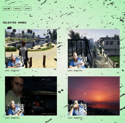
On the train ride home from teaching I did some more tests on the projects page. One question I had was whether I could replicate the gallery container individual items using semantic html rather than individual added classes. It seems like this approach should work, and I started modifying the css.
After a good bit of wrangling I was successful. What this means is that one should be able to write the gallery landing page in straight markdown. So for example:
turns into:
<figure>
<img src="assets/img/projects/project1/1.jpg" alt="Project 1 name" />
<figcaption aria-hidden="true">Project 1 name</figcaption>
</figure>
And because of how I edited the CSS page this gets automatically placed into the CSS grid. I need to modify the CSS some more to get it chunkier in a way that I like. Here is the first working version, though not yet styled the way I want it, but it is a proof of concept and shows that markdown alone can produce the gallery page:
After a pause I realized a fatal flaw. While this does render a nice gallery page, it doesn’t automatically work well with linking each image to its own individual project page associated with the image.
For example, to do this in pure markdown would be written thus:
[](projects/testproject/index.html)Oof, that’s ugly code. And it no longer will produce the accessible figure/figcaption rendered output, and due to the ugly syntax may possible cause mistakes later if I mess up a bracket or parentheses.
I had to rethink my strategy. My options are:
[<img alt="Project 1" src="path/to/image.png">](https://link-to-your-URL/)I’m currently leaning toward this one but need to do more tests and research. I’m wondering if I can write a lua extension so that I get my preferred figure and figcaption output. I’ll have to look into this.
I didn’t have a ton of time today but I spent an hour exploring writing lua extensions as tests for pandoc but I didn’t get anything particularly useable yet. At this point I’m thinking I’ll likely go back to pure HTML for the gallery! :0
More gallery rendering work.
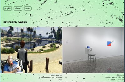
I read up about image options in pandoc markdown, and decided that this markdown solution to producing a gallery of images (with links) with captions would be too monstrous:
[](./projects/lost-angeles){.gallery-item}
**Lost Angeles**
Livestreamed Performance
2016 I don’t think that’s really any better than this:
<div class="gallery-item">
  <a href="./projects/lost-angeles/">
    <img src="../assets/img/projects/lost/lost1.png" alt="Lost Angeles">
    <p><strong>Lost Angeles</strong></p>
    <p>Livestreamed Performance</p>
    <p>2016</p>
  </a>
</div>
The latter is also easier to debug and has less chance of making a syntax error.
I can’t believe how many hours it took me to explore and then eventually settle back pretty much where I started. Anyway, next step will be to actually clean up images, move them into directories, and then build this page. Still a bit more CSS cleanup as well.
Stayed off the computer today.
Stayed off the computer again today.
When you get bogged down, pivot. At least that’s what I tried. I didn’t feel like working on organizing my project image directories yet or building a template project page, and was still bummed by my gallery markdown generator turning up lemons. So I decided to work on the landing page. On a whim, on the train to school on the way to my last Programming for Visual Artists class I started trying something out, then continued in my office before class, and then again on the train home again tonight. And I’m pretty happy with what I’ve done though I’ve yet to get outside feedback, and it’s possible I may feel differently later. So caveat emptor: this could all change tomorrow.
What I like about it: it’s both chunky and readable. It feels like a cross between my competing aesthetic and project goals. Text-oriented, but still supporting images. And a nice ‘timeless’ design (whatever that means). It doesn’t look totally out of place from my programmer-y friends sites, but also isn’t totally 180 degrees from an artist site. Though perhaps too much text up front?
Next I worked on the file size issue. The background jpeg was pretty big, 422k. Yikes. My goal is to try to make the image look as hi res as possible while as low file size as possible. I know that’s a squishy goal. Should I start with the lowest resolution and use a media query to switch out images and serve a higher resolution file on bigger screens or with certain browser indicators? I’m not certain.
First I reached for the imagemagick ‘swiss army knife’ tool, one of my beloved software tools. I ran some imagemagick conversion tests to try things out trying to chase the goal of highest quality resolution while minimizing image size.
I tried a number of ways to limit file size. I took a somewhat staged photo of my messy desk in my office at school, then converted to jpeg and limited the image to 1920x1280. The image was 422k. I read a stackoverflow answer and a short article with several techniques that I tried out: “lighthouse” image compression, gaussian blur, and a mix of the two. I didn’t think the lighthouse approach looked good, and neither did the mixture one. The gaussian blur looked best to me and was compressed almost as much.
#convert with gaussian blur and 50% quality
convert desk.jpg -strip -interlace Plane -gaussian-blur 0.05 -quality 50% desk-gaussian.jpg
Then I tried out a different imagemagick technique, the “define” parameter. To be honest, I’m not sure what this algorithm is, but I had success with it as well, and it’s a more straightforward command. Essentially, you list what filesize you’re targeting. When I specified 200k I got an image I could accept. When I tried 100k it was too low resolution. 150k was the minimum I found to be tolerable.
#convert using defined max file size
convert desk.jpg -define jpeg:extent=150kb desk-limit-150k.jpg
The compression technique was different between these the gaussian blur and the defined filesize approach but it was a toss-up which one was better.
Okay, I think I’m at a good stopping point tonight. I’ll go back to working on the gallery pages next I think.
Lots of non-computer activity today. I went on several hours worth of bike riding today on the road, in the park and on the trail, despite the cold. Tonight I saw a noise show at Trans-Pecos in Bushwick. It was a pretty great performance by The Daxophone Consort.
I got home and first did some research on opengraph tags, which I’ll only call OG tags going forward. I am vaguely aware of these but never looked into them before. It only took a couple minutes to track down the info thankfully. These are used for the “cards” that pop up on social media, which I knew, but nothing else. There are 4 that should always be used, though 2 basically copy the title and url. The other 2 are type, of which it’s either “article” for writing/blog, or “website” for everything else, and og:image for a thumbnail. Did I mention these were invented by Facebook, for this nonsense? Nonetheless I think I may add them. So the 4 to include: og:title, og:url, og:image, og:type. It’s a good idea to also include og: description. og:description should be 2-4 sentences, and can just copy the meta description, which I should also add. The og:image is the most important because this is the image that will pop up on social media feeds. The og:title should be the “raw title” without the site name. If I go the route of creating frontmatter I can probably include some of these in the frontmatter if needed and have them auto-populate in the header.
Back to working on the gallery page. I took a different tact and decided to browse gallery pages that looked good to me. First I visited Cargo and viewed their Sites in Use page, then selected a few I liked. They create templates for artists and designers. I’ve used their sites for inspiration before when creating my own websites. Their images load slowly and I find myself closing the page before they are done rendering. Their text is often hard to read or most of the time, absent. Their lightboxes are often crummy. So there’s a lot to like in layout but the details often dissapoint.
Here’s some sites I liked: This very simple 2up gallery page, though the individual pages are slow and hard to read; this single column gallery looks good and I like the interstitial text descriptors between, though there are no individual artwork pages; this random placement portfolio I thought was simple and looked nice and bold with background black and individual project pages were clear enough but needed a lot of scrolling.
Based on this, I decided to temporarily abandon my work on the gallery page I had done previously, and now I did some basic flexbox layouts. Here’s a super simple one, no gaps, 2 columns.
Will try more on the train tomorrow during my last day of class for the semester.
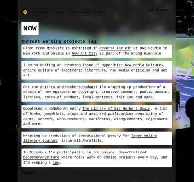
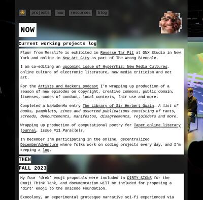
Woke up early to get to school for a meeting. It’s the last day of the semester in-person for me. I picked up donuts for the students enroute. I coded a bit on the train and almost overlooked getting out at the right stop. Later I had a short break between a meeting and class so I dropped off some pies to the admin assistants as a holiday treat, got myself lunch, and then worked a bit on the site. After class I took the train home, worked a little on the gallery page. In the late evening I tried many things out. I added the nav bar correctly to the gallery page, then merged my dev branch with my main. I tried applying my decemberadventure stylesheet to the now page and resources, but after checking them out, I didn’t think they were compelling. I tried replicating what I had done on my new homepage prototype and found I liked that look a lot more.
Here’s the now page, albeit with some bugs. I need to add some background color to the nav.
Here’s a bookmark to a 2up gallery page made with Cargo. I want to revisit this later when working on individual project pages, though the nav is bad and pages lack text descriptions and links. This is the other gallery page I built in flexbox before the current simpler design, but I think its nav at the top is simpler and maybe better fits my page design than the one I have currently.
Worked on school things today. In the evening, Laura’s flower shop had an opening party that we went to.
Editor meetings and school work day.
Grading, cooking, then performance and solstice party night.
Worked a little bit on the site tonight. Started working on an individual project page template and tried a few different layout and modifications in CSS, mostly using a column approach. In some tests I tried running images full-width and in others I had a centered column. I’ll spend more time on this in the coming days.
End of semester grading work and hanging out with my partner, watching a movie, but no coding work.
Worked on the now page a bit to clean up the design.
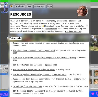
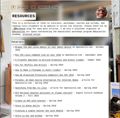
I did some work on the resources page as well. I tried finding a good background image, but I think I could still choose better. In any case, here’s my placeholder for now. I’m also uncertain if “resources” is the right term for the page. Should it be a “wiki” or something else? I know I want to link to my workshops, classes, tutorials, podcast, things like that. I guess some of those are also “projects” but I’m thinking of “Projects” as holding my art projects and this “Resources” page as my teaching and organizing. Will think more on this, but for now, “Resources” works.
Hmm, I think the Resources background text blocks look better than the Now page groupings. It’s a bit much to have those separations between the individual paragraphs.
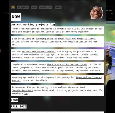
Okay, after some crazy css wrangling (and help from my partner), here’s a version of the Now page with the paragraphs grouped together. I think it looks a bit better.
This is still “classless” but I’m using some bizarre css-selector combos so I’m not sure it’s worth not using classes/id’s for this!
This seems like a kludgy solution, but on second thought, there is a certain charm if not elegance:
h1 {
 margin-bottom: 1rem;
}
h2, h3 {
  clear: both;
  display: table;
  background-color: white;
  margin-top: 0.5rem;
  margin-bottom: 0.5rem;
}
h3 ~ p {
  background-color: white;
  margin: 0;
}
Well, it works.
I realize I have been putting off the inevitable organizing task of grabbing photos, placing them in directories, and making individual project pages. If any part of site-building demanded automation, that would be it. I hope I can pivot to this soon. I want to finish up the site design this week and deploy by the end of the month.
A short while later, trying a new background image out for the resources page. I think this looks better.
A few days off. Tonight I did a backup of custom functions from the tilde server I created for the Social Software class. This isn’t a backup of the whole server or its software - it’s more like the students’ custom functions, my intro, and then our created command line thumb program (a function) that is like a wrapper around finger that creates a tiny little social media on our server. I retired the server so I don’t have to pay a monthly fee out of pocket after the course ends.
Worked on some styling cleanup on a few pages of my website design. After a few days away I still feel pretty solid on the design and just need to dedicate a few hours to building the gallery pages now, but I’m not sure when that time will come since it’s a busy “vacation” this week. I’d really like to be done by the end of the year.
Looked at my old photocopyfier program. I’d like to port this to love2d with a gui I think.
Spent some time with Runna. I think the game is compelling, it just needs final graphics/theming. I’m wondering if it makes sense to partner with someone else, or purchase/find assets, or try to draw them myself.
Started building out some frontmatter system for the individual project pages.
My parents visited for a few days and I did some work on the site but haven’t finished yet. Will have to keep going into January.
Spent time the past week or two finishing the Programming in Lua book, and am now onto another Lua book for bedtime reading. I also checked out winduptoy’s Lichen ssg, and review some forth / html gui ideas.
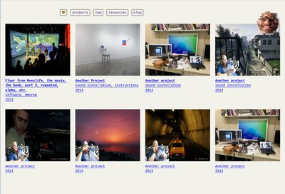
On my webiste project I’ve done some more tweaking and playing. Tonight I revisited my gallery page yet again. Maybe simple is best. I spent time looking at Aram’s website Works archive and Increpare’s and while I can’t quite match their output, I do pump out work pretty consistently. They both use a simple grid layout, with title, medium, year, thumbnail - and I think I should try that. Aram’s I thought was an even grid but it’s more a coincidence that he chooses the same size image. Increpare’s is a consistent grid.
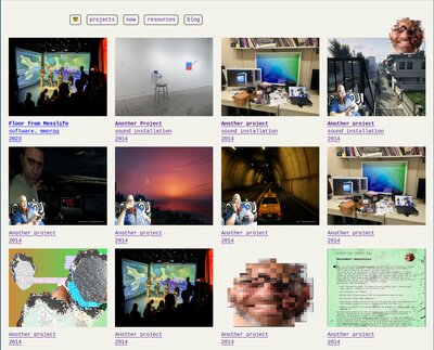
I still need to work on this a bit, and it’s uber-basic, but I think it will serve my purpose of allowing for displaying lots of work. I got down a first version of the responsive view but it’s not dialed down yet. Images are stretching funny.
Adding the year (or year and month) is important, to show that the page is dynamic with new projects. Adding the “medium” I think is informative here as well. So here’s each label:
Title (in bold)
medium
year
I re-visited Elliott’s website and he’s again changed it up completely. This is the second site redesign in a month or so. I admire his experimentation though I don’t think I can expect my guests to come back as often or to be as jazzed at these kinds of big changes. But still, how can I maintain some of his experimentation and flexibility to add new things on the landing? Maybe drop-in hand-authored html? Images wrapped in links? Will keep in mind some ideas.
Next step is to improve some of the responsive Css for the gallery page, then work on more on the design for the individual project page. Aram’s project page template is again a good model I think, though I’ll want to also have the project description there, before any links.
I’m not quite in the home stretch but I’m getting there. I’m feeling like all the parts are pretty much in place. I just need to finish the project page, clean up CSS differences between pages and in the nav, and then complete a consistent, replicable workflow for updating pages.
I have returned. After New Year’s, yadda yadda yadda, I’m on vacation in Portland. Tonight I finally sat down for a few minutes, and with fresh eyes, fixed a few bugs on the gallery page. I’ve also made it look pretty blocky basic, oy, but that’s what I want now.
’m on a vacation of sorts, though still doing some prep for class next year. I’ve been submitting paperwork, tightening and studying and prepping learning outcomes. This isn’t the most creative, but it’s required to get my Programming Games coures approved for next year.
This morning we escaped a blizzard up in the Columbia River Gorge and headed in an early bus back to PDX. We visited a nice cafe downtown in a hotel, got some food and coffee, and then I spent a couple hours researching fonts and testing more design.
Originally I had thought I’d do no font loading, but I found I liked a more exciting and strange font. I hadn’t looked into font size and formats in a long time. It seems all browsers work with woff2 and that they are quite compact, so I’ll load 1 or 2 fonts max that add some spice to my website. My next steps will be to clean up the header for the gallery page.